In advanced analytical technology, sophistication should not feel complicated.
The most powerful systems are those that transform complex science into intuitive experience.
This belief has always guided NIRLAB — and it is now reflected in our renewed brand identity.
As a Swiss-based spectral solutions company, we operate at the intersection of advanced spectral modeling, data analytics, and algorithmic precision. Our technology has grown. Our international presence has expanded. Our integrated software ecosystem has matured.
At a certain point, it became clear:
Our visual identity needed to reflect the scale and depth of what we had built.
A Logo with Symbolic Depth
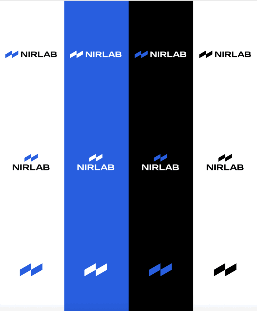
At the heart of the new identity stands a redesigned logo that embodies both science and origin.
The linear elements reference spectral lines — the fundamental patterns captured through near-infrared analysis. These lines represent signal, data, and algorithmic interpretation. They are the visual abstraction of what NIRLAB transforms into actionable insight.
Subtly integrated within the structure is the silhouette of Swiss mountains.
The mountains symbolize stability, neutrality, and discipline. Switzerland is globally associated with reliability and high standards. The peaks reflect foundation. The spectral lines reflect analytical intelligence.
If you look closely, you will also discover a hidden “N” within the two simple strips.
Together, they communicate a clear message:
Structured science, grounded in stability.
The logo avoids unnecessary ornamentation. It is deliberate and confident. It communicates depth through restraint.
Simplicity Over Complexity
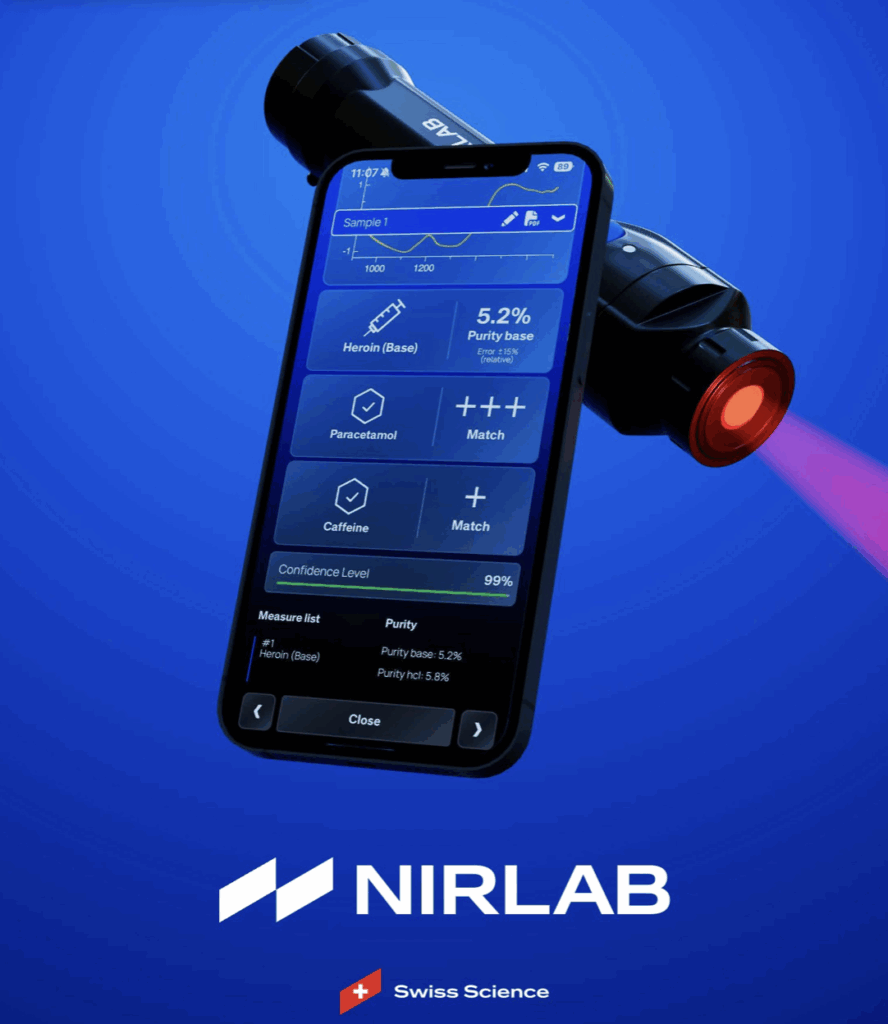
NIRLAB’s platform operates through advanced spectral modeling, data analytics, and algorithmic processing.
Behind each prediction lies sophisticated calibration logic and multidimensional data interpretation.
Yet the user experience must remain intuitive.
The redesigned mobile application and web portal have been streamlined for clarity. The user experience mirrors this philosophy.
The complexity remains where it belongs — within the algorithms.
This balance between backend sophistication and frontend simplicity defines the new design direction.
A Clean and Confident Visual System
The updated color architecture introduces focus and coherence.
Clean contrasts improve readability across mobile screens, dashboards, and corporate communication. The palette reflects technological confidence while maintaining visual calm.
Every element serves functionality.
The overall brand expression is modern, structured, and user-centered
Unified Storytelling
As NIRLAB’s ecosystem evolved — connecting device interfaces, mobile workflows, and cloud analytics — its narrative evolved as well.
Today, NIRLAB stands as a precision-driven spectral solution built on:
- Scientific integrity
- Data clarity
- Scalable digital architecture
- Intuitive design
- Swiss reliability at global scale
The communication is confident and focused on measurable value.
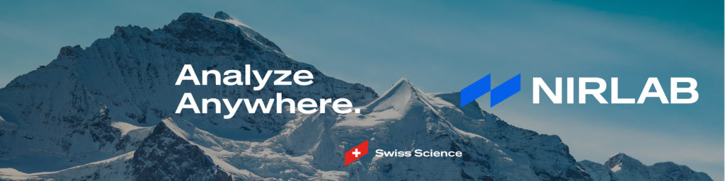
Swiss Quality, Expressed at Scale
This transformation is not a shift in direction, but a refinement of expression.
Scientific standards remain rigorous.
Precision remains foundational.
What has changed is the clarity and strength of how that quality is presented.
The renewed identity reflects a company ready to scale globally — confident, structured, and precise.
Behind every spectrum stands structured data.
Behind every prediction stands Swiss precision.